

Stretchy Widgets
When building a responsive site we, need to make our widgets flexible and want them to look sharp on Retina displays. How do we do it?
The first thing to be said is that a site needs a design. Design should not be an afterthought. Design influences markup, therefore if we do design after markup is written, we will need to rewrite our markup. We will probably also be left with CSS rules we are not sure we can delete.
If you are a good coder, there is a high probability that you are not a good designer – even if you think you are. Coders and designers are also in the same ballpark for salary, so it is inefficient to use a developer as a designer. They will take longer to complete a design, and the end product will be worse and cost more. Instead, we chose to use a local freelance designer for our site.
Once we had been given the design, we had to think about how to make each element stretch to enable a responsive design, and preferably to do that with as little markup as possible. I also wanted to use as few background images a possible.
CSS Triangles
One trick I found very helpful was CSS triangles. By varying the size of a DIV, its borders widths and making some borders transparent, we can produce all kinds of triangles:
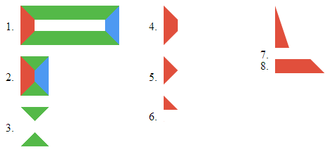
This even works in IE 6. Someone has even written a 3D renderer using this principle (it works in browsers that do not support WebGL).
The nice thing about these triangles is they look sharp on 'Retina' displays without us needing to do anything extra. For this reason, we want to use them where ever we can.
Before and After
CSS :before and :after selectors allow us to add pseudo elements before and after a specified element. A pseudo element is an element that does not appear in the markup but does appear in the DOM.
We can add borders to pseudo elements, and also set their size. So we can use them to add two CSS triangles to any element without adding any markup. However, we need to set the content through a CSS rule in order for them to appear at all, e.g.
.italy:before {
  content: '';
  border: 16px solid green;
}
.italy:after {
  content: '';
  border: 16px solid red;
}
<span class="italy"> Italy </span>Arrows
We used this for our arrow buttons. I used a bottom border in the 'before' pseudo element and a top border in the 'after' one. I then used negative vertical margins to superimpose them behind the text. This allows us to create arrows with a single element so they can be used on a normal link:
<a href="" class="arrow-button-green">green arrow</a>
Note that the arrow will grow to accommodate text:
In practice, we use SCSS to allow us to control how pointy the arrow is and its colour. But you can see the more simple generated CSS here.
Ribbons
Ribbons are the same as arrows. But we use top borders above and bottom borders below:
<div class="ribbon-green">Green Ribbon</div>To centre the ribbon with a double line on either side, I used a table layout (see code). Note that in order to set the height of the 'before' and 'after' pseudo elements, I set their content to be a non breaking space content: '�000a0'. The centred ribbon required a lot more markup:
<div class="ribbon-center">
    <div class="ribbon-pad-dashed"></div>
    <div class="ribbon-wrap">
      <div class="ribbon-green">Central Green Ribbon</div>
    </div>
    <div class="ribbon-pad-dashed"></div>
</div>Notes
For 'notes' I made a small compromise, in order to reduce the number of elements needed. I used a white 'before' CSS triangle to clear away the background of the page fold, then a green 'after' triangle for the folded section. The disadvantage of this approach is that notes will only work on a white background. With wrapper elements it would be possible to make a page that worked on any background.
<div class="my-note-green">
<h1>Notes</h1>
<p>
For notes ...
</div>Top Menu
This was quite a challenge. A close inspection of the artist's mock up showed the background was complex. There was a bevel on the edge and a drop shadow underneath. The bar was darker on the left than on the right and darker at the bottom than at the top, but it was not a diagonal gradient. I did not want to use images so I used the following approach:
- bevel: translucent black inset box shadow
- drop shadow: offset transparent black outset box shadow
- shading: two translucent black and white gradients – one left to right and the other top to bottom
- corners: CSS triangles
Note that I used translucent black and white for shadows and highlights as this allowed me to change the background colour while keeping the shading.
Clouds
For the 'cloud' elements I used two SVG images, each of which is double the minimum width of the main section and half its maximum width. One is attached to the left the other to the right. They slide past each other as the screen squashes and stretches. I used SVG so that it looks good on 'Retina' displays, and falls back to PNG using modernizr for older browsers.